
Tuesday 27 December 2016


Tuesday 20 December 2016


Monday 19 December 2016


Thursday 15 December 2016
Institions Research 2
RhineGold publishing is a UK based media institution which produces magazines for the music and performing arts. They publish magazines such as Classical Magazine and Opera Magazine. Rhinegold cover a wide variety of topics ranging from singing to instrument works and also magazines for teachers. They even produce brochures and leaflets for clients.
On the homepage on their website you can see concerts and upcoming events advertised. it is also easy to navigate around this is due to the bold heading in a banner at the top of the page. There are also a lot of images. This will attract a younger audience.


Thursday 1 December 2016
Planning- initial ideas for photographs for: the front cover, DPS and contents.
For my front cover I will use a large photo of my feature star in the middle of the page with the text, text wrapped around it. I decided to use picture a picture with a church walk way as I feel it is a good concert shot with a typical smooth Jazz venue for the background. Indya will be in all black and will be holding the clarinet while resting on her right hip. Her make up will look natural and I will use a nude lip balm. However I will use more mascara, eye shadow and contour.
For the contents page I will use multiple pictures. These include ones of all three artists plus one of all the instruments. These will be in different locations. Ryan will be stood playing the trumpet on a white background wearing all black. He will be in concert dress and he will be playing the trumpet in a very relaxed style to mimic the genre of Jazz. Kacie will be wearing a navy blue hoodie with jeans and I will use a plain background. Indya will be leaning against a post of a band stand. looking past the camera. She be wearing a warm jumper and jeans and will be holding the clarinet loosely across her body. Again natural make up will be used for all artists.
Finally for my DPS I will use two images of Indya. For this I want a picture of her laughing, having fun and acting natural. This is more likely to attract my TA rather than a serious picture. In this she will be wearing a white shirt and black trousers. The second picture I will use I have yet to determine. However, when the images have been taken I will decide then.
Wednesday 23 November 2016
Research: TA Analysis of Questionnaire 2
1. How do you consume print media?
Upon reflection, out of the 20 people I surveyed the majority said they bought music magazines in shops. This would be good for my magazine sales because most people consume media this way as it easily accessible. The least popular choice was online subscription. Although it is easily accessible and easier to read, not everyone has access or has preference to the internet. In conclusion, the best distribution methods are shop brought magazines or downloadable or streamed magazines.
2. If you don't buy/download magazines, why not?
From my survey, the majority said that even though you can download magazines you can view online without the need to pay or subscribe to them. Those surveyed said various opinions like "...the youngsters of today prefer to gather their information through different types of media e.g. video or interactive based media rather than through literature". Also, copies on the internet are free which appeals to students especially.
3. What would encourage you to buy/download magazines?
Those surveyed stated that they would buy/download a magazine if the article of the celebrity appealed to them. Also, a frequent answer was bright colours and clear pictures. This is good for my magazine as if I include these things it will be more appealing to a younger audience as they are more likely to look at the image first rather than read the article. From my survey, I have learned that my target audience are not as worried if I have used good quality paper for my pages.
4. What do you expect to see on a front cover?
The main thing that people want to see on a font cover is that the feature story image is large and stands out. They also want to see the main star on the front cover. This is a good feature as it shows the reader who the magazine is about and also grabs people attention on the shelves. I will include less terminology as I will have an audience who may not have experienced the jazz genre before.
5. What colours would you associate to the genre Jazz?
There are four main colours which people associate to Jazz. These are gold/yellow, white, Bronze and black. This is because jazz is seen as a classy genre but also black relates to its history of southern America and the time of the apartheid. The least popular colours were blue, red and brown. Upon reflection, I will use gold, black and white as it appeals to my target audience the most.
6. What images would you expect to see on the front cover and contents?
From my survey that I conducted, my results show that genre related items such as instruments and Jazz artists. This is so that people will know what the magazine is about. They also said they liked to see synergy between the pages. This makes the magazine look neat and presentable. Only one person said they would like to see a bold picture of the feature artist on the front and multiple images in the contents.
7. What would catch your eye on a magazine front cover?
My most popular answer was that people like to see bright and vibrant colours. This will catch there eye therefore will attract people to my magazine and not others. Another answer that was appealing was bold letters/ masthead/ images etc. I feel that because of the age group I am trying to appeal I need lots of this to attract them to the magazine. They are not so bothered if the artist is smiling or serious.
8.How much would you pay for a magazine?
A good price for my magazine is £2.99 as most of those surveyed said they would pay between £2 - £5 depending on the quality of the paper would vary the price. Upon reflection less people would pay between £0 - £1.
Tuesday 22 November 2016
Research: Questionnaire 2
- How do you consume print media?
- If you don't buy/download magazines, Why not?
- What would encourage you to buy/ download a magazine?
- What do you expect to see on a front cover?
- What colours would you associate to the genre, Jazz?
- What images would you expect to see on the front cover and contents?
- What would catch your eye on a magazine front cover?
- How much would you pay for a magazine?
This is the second questionnaire I gave to my target audience and the one I am going to do my in-depth analysis on.
Saturday 12 November 2016
TA Research: Questionnaire 1
My Questionnaire
I asked 20 people these questions and I had a mixture of answers. For example:
1. Through subscription to the magazine company.
I do not read magazines.
2. N/A
I like to read more fictional books than magazines.
3. If it's a genre I'm interested in.
Interest in developing musical knowledge
4/5 I thought it grabs your eye due to the larger image.
I thought the masthead was eye catching and intriguing.
6. No, because it is fun and lively and fits the genre.
Yes, it is a bit too involving
7. Yes, because it follows the nit and the git of the heritage of jazz. However, the gold indicates the classiness that jazz can be.
8. The featured stories of the magazine seemed interesting and made me want to read them.
The image because it is large and eye catching.
9. Yes because it is accessible to the intended target audience
No because students don't earn enough income to buy a magazine weekly.
10. Yes, because there is everything which would be expected to be included in a jazz magazine.
11. Yes, because the images make the front cover appealing.
Yes, because if there were anymore the magazine would be too crowded.
12. In the contents, the font size is a little small and is uneasy to see.
It is a good size for the target audience.
13. Yes, because all references are jazz related.
No, because there are too many artist references.
- How do you consume print media?
- If you don't buy/download magazines, Why not?
- What would encourage you to buy/ download a magazine?
- What are your initial thoughts of the front cover?
- Does the front cover catch your eye, if so Why?
- Are there any changes I could make to the masthead. If so what?
- Did you like the colour scheme, if so why?
- Which features of the front cover really caught your eye and why?
- Is the price reasonable?
- Do you think the features are appropriate to the intended target audience?
- Do you think there are enough images to attract the appropriate audience?
- What do you think of the font size, is it too big or small?
- Are the language and register appropriate to the genre of the magazine?
I asked 20 people these questions and I had a mixture of answers. For example:
1. Through subscription to the magazine company.
I do not read magazines.
2. N/A
I like to read more fictional books than magazines.
3. If it's a genre I'm interested in.
Interest in developing musical knowledge
4/5 I thought it grabs your eye due to the larger image.
I thought the masthead was eye catching and intriguing.
6. No, because it is fun and lively and fits the genre.
Yes, it is a bit too involving
7. Yes, because it follows the nit and the git of the heritage of jazz. However, the gold indicates the classiness that jazz can be.
8. The featured stories of the magazine seemed interesting and made me want to read them.
The image because it is large and eye catching.
9. Yes because it is accessible to the intended target audience
No because students don't earn enough income to buy a magazine weekly.
10. Yes, because there is everything which would be expected to be included in a jazz magazine.
11. Yes, because the images make the front cover appealing.
Yes, because if there were anymore the magazine would be too crowded.
12. In the contents, the font size is a little small and is uneasy to see.
It is a good size for the target audience.
13. Yes, because all references are jazz related.
No, because there are too many artist references.
Thursday 10 November 2016
Research: TA Profiling

The target audience for this magazine is of the ages 17- 21. I can tell this because there is reference to drugs. This would not be put in/ on the front cover of a magazine for 10 - 16 year olds. It is for the "mainstreamers" group and the "individual" group. The "mainstreamers" group are people who like stability so they only buy the top brands. Q is one of the top music magazines in the world. The "individuals" group are an additional group to the four main ones. These are the people that on it by the product for the product image not the actual product. He is looking at the camera which tell us that the magazine is trying to grab the readers attention.

The target audience in this magazine is 16- 25. I can tell this because girls of that age are influenced by styles they see in magazines. This also puts Mulvey's theory in to practice of "the male gaze". This means that girls were styled as eye candy to the boys. They are styled as a sexual icon. However this could also be empowering to women. Especially the colour scheme being pink which is the stereotypical colour for women. This could fall under the "tribe-wired". This means that these people are digital, free spirited, creative young singles. They can also be "aspirers", which means that they are looking to improve themselves in image.

This edition is aimed at children aged 11 - 16 of the upper class families. This falls into the "aspirers" category because it is aimed at young musicians trying to become professionals.
Saturday 5 November 2016
Target Audience Profiling
Kenza Hardy's Slidely by Slidely Slideshow
My chosen music genre is Jazz. My Target Audience will be 16- 21 year olds of a middle - upper class people. Usually Jazz music is stereotypically seen for the upper class people of the 30-50 males. This is called Demographic profiling. This mean that people are group in categories such as gender, class, religion etc. However, its background suggests otherwise.
My magazine is going to be for the "aspiring" and "succeeders" group. The "Aspirers" group is a group of people that are trying to improve themselves. This is a good group to aim my magazine around as there are always musicians looking to improve themselves. In addition there are more younger and talented musicians in this generation as there have been in previous ones. This means there will always be customers for my magazine. The "succeeders" group are for people who feel they are in control and have power. My magazine will be good for them because agents and talent scouts can view my magazine and discover new talent.
There are two other main groups of people. "Mainstreamers" and "Reformers". "Mainstreamers" are people who like stability and security. This means they will only buy secure, well - recognised brands rather than new one. This is why my magazine is not suitable for them as my magazine is new. "reformers" are people who are only interested in buying environmentally friendly products.
Also my magazine will be for the "Fun/ Atics" group and the "Dynamic Duo's" group. The Fun/Atics group are Aspirational, fun seeking, active young singles. This is suitable for my magazine because musicians are very aspirational people and it can rub off on others. Also the "Dynamic duo" are high involvement couples. Jazz bands are a good way for couples to bond as they are doing something they both love and couples usually meet through being involved with the bands.
Blumler and Katz suggested a series of possible reasons why audience members might consume media. These were diversion, personal relationships, personal identity and surveillance. In my magazine, I will use the following categories; Diversion, In my agony aunt section, personal relationships, for emotional and other interaction and personal identity, for learning values and constructing their own identity.
Denis McQuail expanded on Blumler and Katz theory by suggesting that audience motivation is more detailed than what was originally thought. For example, groups include information (seeking advice), learning (self education), personal identity (finding role models), integration with society (a sense of belonging in a group) and entertainment e.g. filling time.
Tuesday 1 November 2016
Star Image in different magazines
My chosen group to analyse is One Direction. I will be looking at the different magazines they are featured in and comparing them to genre etc.

The first magazine is "Top of the Pops". Top of the Pops is a children's music magazine for the ages of 9 - 14 year olds. You can tell this is an older issue from around four years ago because if you look at recent images of the group they look very young. You can also tell that it is made for a younger audience because they are happy, smiling and dressed stylishly. The story is also for a fairly young audience as younger girls take a liking to their idols, this is why they are seen as gentle and caring guys. The boys are wearing light colours to match with the light colours on the front cover. They are all catered to their own style. Their clothes are based off their own style. This is part of Dyer's theory of "a star is just an image" because the artists are styled to come across to a younger target audience. However, they are also style to suit their own fashion sense instead of someone telling them what to wear they have had an input into what they wear.

This "Seventeen" magazine is for an older audience of the ages 16 - 21. One Direction are styled for an older age because they have a serious expression and they are dressed to create an image. their dress code coincides with the article. In the article they are portrayed with pranks and secrets. They are dressed in dark clothing which works well with the red background and the light text. The style makes us think that they are bad boys. A lot of the 16-21 year olds are attracted to bad boys. This supports Dyer's theory.

In this issue of "Fabulous" magazine they are wearing the same clothes as "Seventeen Magazine". However in this magazine, the front cover is in black and white. This could be to symbolise what the article is about. The article is about the fame and the money of the boys. The black and white symbolises that it may be getting to much for them. For example the serious looks on their faces could suggest pain. Like the one above this magazine is also for the ages of 16- 21.

BillBoard magazine is another magazine that is for the older teens to early 20's. The football symbolises the title of the article. The word "score" can relate to football. The boys are dressed as if it is a summer night but is transitioning to summer.
Research: Consolidating My Research
Front Cover
For the first front cover I will use unisex colours so that it appealed to both genders. I will incorporate this into my magazine. I will use one image.
For my second front cover I will use serif font with no kerning or the masthead. In this I will include the image under the masthead. This looks more professional. I would like to use more writing on my front cover. Same for third front cover.
Contents
In the fourth front cover I saw the use of a lot of conventions. There were word conventions to do with the genre, such as "pedalling". There was also magazine house style. in all issues of this magazine the colour scheme, layout and text are all house styles of Pianist Magazine. I also like how they had used the space well in the magazine and the use of a few pull quotes.
In the first contents research I liked how a Sans serif font was used for the text. It is easier for my target audience to read. I will us a number of pictures and make sure the contents isn't lacking any. I will also try and balance the number of text there is. I need more than little because people will be interested
In the magazine I analysed for my second contents, they used the same pushed together writing for the masthead. They do this by creating separate text boxes and pushing them together so there is no kerning. However the layout was unprofessional with only one image on the page. I liked the use of text wrapping around the image. I will defiantly be using this in my magazine.
In the third contents I liked how neatly it was set out. The information was clearly visible and easy to navigate around the page. Due to the writing being against a white background and the text being written in lack, it is visible to the audience from a distance. I liked how they had added a lot of images to the page to get the point across of a brass band magazine. There were the right amount of images used. At the bottom of the page there is a faded blue banner. This is good because it doesn't hide the text on it and makes it stand out. It is in synergy with the magazine and it gives the page some colour.
DPS
In the first DPS, synergy is created between the artists, the writing and the front cover. The colours of the magazine match the colours of the artists clothes. Also they are the same colours as the front cover and the contents which look neat and professional. Again the DPS also used text wrapping which made everything visible as the text wasn't covering the image. There is also a play on words. The group is called "The Spitfires" and the title is "Reach for the Skies". This is the clever because there is a film about the spitfire plane called "Reach for the Skies". They also use a target on the cover which symbolises the RAF target.
In the Second DPS I analysed there was only one paragraph of text used. To make my DPS look more professional I will use two or three paragraphs. Maybe four. I will also use the same colours to create synergy. In this i also liked the idea of using a pull quote for the title. This captures the reader and automatically gives them an idea of what the article is about.
In my third analysis I liked how the image shows teenagers what is done in a lesson. This will encourage people to read it because it related to the article and also shows non musicians that its not all about writing and you do get to play in lessons. It also appeals to the older generation because of the type of genre and the image is of both teacher and student. However the writing is difficult to see because it is not in bold and it is in italics.
Monday 31 October 2016
Research: DPS 3
How this as influenced my planning and creativity

- The image shows a lesson to attract a younger audience
- The writing is difficult to see as it is in italics and not that bold
- It is set out so people know where to read next

Planning: Star Image
For my DPS and front cover my feature star will be Indya Magrath with her clarinet.

I will use this mage for my front cover. I will use this because it is all about capturing a younger audience and if they see a girl the same age as them having fun then they are more likely to get engaged with the magazine. Also more females will get involved because Jazz has always seemed more male dominated.

I decided to use this photo on my contents page as it shows a more serious side. It is an image that stands out and will capture peoples eyes. It also goes against a stereo typical Jazz player. They are seen as scruffy, haven't got a care in the world men but as time has progressed I feel this image shows that it is no all males and that it is a smart genre of music.
The look I am trying to achieve is a modern look that re-presents the change in time with regards to the role of men. I am also trying to get the point across that Jazz is a flexible genre that appeals to everyone.
People will think that Indya is an upper class, rich girl who is into Jazz. Also that she is serious about music and that she has fun doing it. They will also think that she is smart.
I will use studio based photos with different backgrounds and take shots of a jazz band during rehearsal.
The images will attract a target audience of 16- 21. This is because I am using a young model. Younger people will look at her and think that they can do what she does. Also she will stand out on the background.
This shows that Dyers theory "stars are just an image created" is true. I have created an image for my star which has synergy with the genre and magazine. Star don't have a say as it is there managers/ stylists that decide what they where to fit the type of genre they are trying to create.
For my front cover I am going to use one photo of my picture star that uses the space of the entire page. My star will be wearing a white button up shirt, smart black trousers and nude heels. I will take a side shot of her laughing and looking over her shoulder, holding the clarinet.
For my contents page I will use several images. I will use one of the North Lincolnshire Music Centre Jazz band in rehearsal, one of all three instruments and one of each of my stars. My stars will be in either casual or smart clothing appropriate for the genre.
Finally my DPS will include one full length image of my feature star and maybe one more of her at a mid length shot.
Thursday 27 October 2016
Research: Locations

This background uses synergy between the artist costumes, guitar and the text. There are all orange, black and brown. The background is good for the genre because acoustic music reminds you of live lounges of artist singing live acoustic versions of their songs.
This photo was shot during a rock concert. You can tell this because of the type of clothes they are wearing and the typical rock band layout. For example there are two guitars a drum kit plus other members of the band. A rock band image would not be taken in the middle of a field in smart jeans and a shirt. This is how the image sticks to conventions of the genre.

The location goes hand in hand with what the article is about. The pull quote say "This is who I am". this suggests that the artist is protesting against discrimination to Transgender and gender specific roles. This could be to do with some discrimination against the particular artist on something like social media. The location gives us the impression that Transgender people are forced to live on the streets as no one will rent accommodation to them or they have been forced out of their family homes.

The location is set in a winters wonderland. It includes forests with white snow glistening on the ground. There is a lot of synergy used in this DPS such as the pale skin of the artist against the snow covered background, the snowy background and the faded corners of the masthead and the artists clothing colour against the outside scene. This links to the genre as he has written an acoustic song an is sat in the window of his mountain lodge which is where he goes to write his music.

The large picture is based in Tennessee. This is her home state. Due to Tennessee being a southern state, typical stereo types of this are cowboys, westerns and country music. In the top left on the second page there is a picture of Dolly Parton on stage. There are iconic signs between the genre and the picture because a banjo and a tasselled jacket are associated with country music.
Research: TA 1
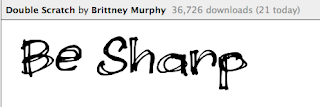
To decide what font I want to use for my masthead I chose 4 names and typed them into a program called 1001 free fonts. The mastheads were Speak easy, Be Sharp, Jazz Days and Jazz scale.


These are the two fonts I chose to put on my target audience survey. I chose these because Jazz as a genre is rough and edgy and has a dark background due to segregation in America. When I surveyed 20 people 4 went for the Double Scratch font and 16 went for the A Bite font.
Friday 21 October 2016
Research: DPS 2

How has this influenced my creativity and planning
- There is only one paragraph used for the article itself. I will use two of three.
- I will make sure there is synergy between all of my pages.
- I like the pull quote that is used as the title
Planning: Masthead
I entered my chosen masthead into the program 1001 free fonts and managed to pick one for my masthead.

The fonts are the two I have chosen.
During the decision process i had to pick between four Mastheads.


The fonts are the two I have chosen.
During the decision process i had to pick between four Mastheads.
- B flat Jazz
- Speak Easy
- Jazz Scale
- Jazz days
Tuesday 18 October 2016
Planning- initial ideas for photographs for: front cover, contents and DPS
Final Ideas:
Front Cover
My first idea is that I want to create a Jazz Magazine for the next generation of Jazz musicians as there is a large gap in the market for Jazz. I want it to appeal to young musicians who play a Jazz instrument (Clarinet, Trumpet, Saxophone, Percussion). My first front cover idea is that I am going to use three separate pictures of my three models spread on the page. They are each going to hold a Clarinet, Trumpet and a Saxophone. They are also going to be dressed in different clothes, One model is going to be wearing casual cloths (jeans and a hoodie), one is gong to wear smart, concert clothes (black shirt and trousers) and my feature model is going to wear both smart and casual clothes. They are all going to be stood in front of different backgrounds but I soon realised how hard this was.
For the text I am going to use serif. This makes it look fancy and classy and also appeals to my audience. I will include 3 cover stories and one feature and also a pull quote so it makes the reader want to pick up my magazine and turn to the page of that particular story. I will also include sub headings for my cover stories. The colour scheme of my magazine will be gold, grey and black.
Contents
For the contents page I will include page numbers so that the reader can easily access an article they want. I will also include two photos of each of my models and the feature story picture will be slightly bigger than the others. My contents will include a list of all the articles in my magazine. I will use serif text for the titles of the articles and then sans serif for the blurb. For the colour scheme I will use synergy between my front cover and my contents and use gold, black and grey. This shows that it is classy and elegant.
DPS
My DPS story will be about Indya and a new set of albums which she is bringing out in the next year. It will feature some background on the album as well as some feedback from the recording studio and much more. A full page will be taken up by a full length shot of her.
Model/ Stars
My Stars are going to be Kacie Rickells, Ryan Frankish and Indya Conway. I am going to use Kacie because she is a saxophonist so she can promote her and her instrument. I am going to use Ryan because he has the model look and makes a great trumpeter. I am going to use Indya because I liked how professional she can make the picture look.
For Indya, her first costume will be her casual costume (Blouse and navy jeans). Her second costume will be a smart concert look (Black shirt and trousers). For her makeup, I will use a natural look with a smoky eye look. This is because it will make her look like she is in rehearsal. Her hair will be in a ponytail as musicians never have time to do their hair before rehearsals. For the musician look, she will be using my clarinet as her prop. This represents Dyer's theory of a star as an image and not a real person. This represents this because I am creating a star from a real person therefore using makeup and clothing to portray them as someone else. This goes against Mulvey's theory of male gaze theory. Jazz magazines are usually represented as predominately male and not for females in the industry.
For Kacie, her only costume will be a casual one (navy hoodie and dark jeans). I will use a similar makeup to the one I used on Indya although she won't have the smoky eyes. Her hair will be in a fishtail plait as I am trying to go for the grungy musician. She will be using her own saxophone as a prop and will be showcasing it off in many ways.
For Ryan, his only costume will be a smart concert look (Black buttoned up shirt and trousers). He will be stood against 2 different backgrounds and will have minimal make up on apart from powder and foundation. He will be holding my trumpet as a prop. By using both genders this shows my audience that the jazz world is for both genders and not just male specific.
We will have a photo shoot in college from 6pm til 8pm on Tuesday 18th October 2016. I will be doing on this date because we have 2 backgrounds in particular which I would like to use and it will be the only opportunity I will get to do so.
My DPS story will be about Indya and a new set of albums which she is bringing out in the next year. It will feature some background on the album as well as some feedback from the recording studio and much more.
I will adhere to the language and register of Jazz (famous Jazz musicians etc) and also images. I will make it more entertaining for people aged 16 - 21 and I will do this by adhering to the codes above. I will break the code of a male only industry.
A wrong turn at the shoot
At the photo shoot I had a bit of a panic regarding costumes and models.
First of all one of my friends was going to lend me a black button up shirt for one of my models. I found out the morning of the shoot that he had forgotten it on the way. I was then trying to find a new male model with a black shirt as my original male model didn't show up when he was supposed to. The new male model I found said he couldn't do it so I had to find someone else.
At the photo shoot someone else's model had everything apart from a black shirt. He had a white one so i could use that. The photographer of the model I was borrowing said I could use the model but then my first model turned up with the black shirt my friend was going to lend me. It all turned out in the end and was a successful shoot.
Monday 17 October 2016
Research 1 - DPS

- I would like to use a similar synergy to the one above
- i like the text wrapping hat is used and will use that in my own DPS
- I don't like the fact that you can't see the writing over the target
Subscribe to:
Posts (Atom)